| | Our New Logo |  |
|
+23Stingray Caxi usampa Mihajlovic010 Ramone gracuno Dan William-85 Biancocelesti NonMollareMai Conn Amir Il Capitano blue-white drake1900 Jofo zoran Ed Cornholio Sile martinese Secret_Samadhi Ermetico 27 posters |
|
| Author | Message |
|---|
Ermetico
Admin


Number of posts : 2227
Age : 62
Country and city : Italia, Roma
Laziale since : 1973
Registration date : 2008-05-02
| Subject: Re: Our New Logo  Fri Jul 02, 2010 12:07 pm Fri Jul 02, 2010 12:07 pm | |
| Meanwhile Grazie for your efforts.
Secret S i think that we can reach the goal is some how and try to make everyone happy( quite impossible) .
As Conn , Il capitano and many others said we need our Logo and , for me , is ok the flag.
Then the Banner for the forum.
What i ask you is to follow the original colours from our existing banner for the world ( very light blue) and the Fonts colours aswell.
Let see what is coming out....
| |
|
| | |
Ermetico
Admin
Number of posts : 2227
Age : 62
Country and city : Italia, Roma
Laziale since : 1973
Registration date : 2008-05-02
| | Subject: Re: Our New Logo Wed Jul 07, 2010 1:41 pm | |
| No News bad news?.................................  | |
|
| | |
NonMollareMai
Aquilotto


Number of posts : 94
Age : 44
Country and city : singapore
Laziale since : 1992
Registration date : 2008-05-23
| | Subject: Re: Our New Logo Wed Jul 07, 2010 4:03 pm | |
| Great job guys!! Very nice! :) | |
|
| | |
Secret_Samadhi
Curva Nord


Number of posts : 502
Age : 44
Country and city : Bosnia-Herzegovina, Sweden
Laziale since : 1994
Registration date : 2008-05-23
| |
| | |
Biancocelesti
Curva Maestrelli

Number of posts : 341
Age : 33
Country and city : Sweden, Uppsala
Laziale since : 1999
Registration date : 2008-05-22
| | Subject: Re: Our New Logo Thu Jul 08, 2010 3:47 pm | |
| Both of them, really good!! | |
|
| | |
Sile
LFever Team Member


Number of posts : 2737
Age : 40
Country and city : Croatia,Zagreb
Laziale since : '96
Registration date : 2008-05-24
| | Subject: Re: Our New Logo Thu Jul 08, 2010 3:49 pm | |
| wow!! nice!!
can you make it like the eagle has a sort of a scarf in its claws with the inscription Lazioland?
Basically that's just beautiful. 1st one is excellent. | |
|
| | |
martinese
Curva Nord

Number of posts : 784
Age : 34
Country and city : Bulgaria, Sofia
Laziale since : 1998
Registration date : 2008-05-23
| | Subject: Re: Our New Logo Thu Jul 08, 2010 4:12 pm | |
| The first one is awesome! Great job mate. | |
|
| | |
Conn
Honour member


Number of posts : 734
Age : 45
Country and city : Italy, Rome
Laziale since : I was born
Registration date : 2008-05-26
| | Subject: Re: Our New Logo Thu Jul 08, 2010 7:29 pm | |
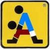
| - Secret_Samadhi wrote:
- This is a two examples of logo I made. Sugestions?

 thanks Secret, looking good! In my idea the shape of the three parts of the logo (eagle, globe & scarf) was more or less like that  but i understand that finding a stylized scarf is not easy. | |
|
| | |
Amir
Curva Nord
Number of posts : 595
Age : 44
Country and city : Kosovo
Laziale since : 1993
Registration date : 2008-05-23
| | Subject: Re: Our New Logo Thu Jul 08, 2010 7:52 pm | |
| | |
|
| | |
William-85
Curva Nord
Number of posts : 570
Age : 38
Country and city : Northern Ireland, Belfast
Laziale since : 1995
Registration date : 2009-05-10
| | Subject: Re: Our New Logo Thu Jul 08, 2010 10:11 pm | |
| Looks good SS!
One thing, maybe its just me but shouldnt the words all be one colour instead of two?
The possibility that I am talking sh!t right now is very high, so maybe im thinking too much about it. I dont know. Its all good!!! | |
|
| | |
Secret_Samadhi
Curva Nord
Number of posts : 502
Age : 44
Country and city : Bosnia-Herzegovina, Sweden
Laziale since : 1994
Registration date : 2008-05-23
| | Subject: Re: Our New Logo Thu Jul 08, 2010 10:36 pm | |
| Thanks all. I was thinking of a scarf with Lazioland writen all over it, but it's really hard for me to find good picture of a Lazioscarf.
If anyone find one, please post it here so I can make an example of it.
FORZA LAZIO! | |
|
| | |
drake1900
Curva Maestrelli

Number of posts : 383
Age : 39
Country and city : belgio ,malines
Laziale since : since i was 7
Registration date : 2009-06-26
| | Subject: Re: Our New Logo Thu Jul 08, 2010 11:33 pm | |
| great job SS  | |
|
| | |
Ermetico
Admin
Number of posts : 2227
Age : 62
Country and city : Italia, Roma
Laziale since : 1973
Registration date : 2008-05-02
| | Subject: Re: Our New Logo Fri Jul 09, 2010 12:05 am | |
| I like n2 ! Some little changes and ....it looks perfect to me. secret on Logo n2 can u give us different patterns? the same structure but different colours? As i wrote u in my p message....and whatever u like The Motto: Fonts size ok Colours; Same as Lazioland colour for Flag,Symbol,colour , borderblack(thinner) like lazioland ONE: Font ok\colour lighter\ Border black( thinner) like Lazioland The Eagle. I am sure that u rotate it a little. So far reduce the size 15%. LAZIOLAND: Font Ok\ Size ok\ colour ok \ Borderblack thinner if possible. Hope is clear. | |
|
| | |
Secret_Samadhi
Curva Nord
Number of posts : 502
Age : 44
Country and city : Bosnia-Herzegovina, Sweden
Laziale since : 1994
Registration date : 2008-05-23
| | Subject: Re: Our New Logo Fri Jul 09, 2010 2:54 pm | |
| I did 2 versions after Ermes directions: The motto is the same colour as Lazioland, did a thinn borderblack. ONE is a lighter biancoceleste colour than before. Lazioland: A thinner borderblack. The eagle: I did not rotated it only reduced it by 15%. The First version is the same colours as before, lighter biancoceleste colour. The second version is with darker colours. If I missed something please notice me. First:  Second:  | |
|
| | |
Ed
Curva Nord
Number of posts : 688
Age : 42
Country and city : England, Cambridge
Laziale since : 1998
Registration date : 2008-07-23
| | Subject: Re: Our New Logo Fri Jul 09, 2010 7:08 pm | |
| Number 1 is my favourite, although I would argue that the eagle should not have been reduced if this is the size of the logo - the detail in the head especially has become blurry. I think the motto around the globe should not have a black outline, it makes the text harder to read and looks squashed more, it looked far better on your previous ones. In other words, apart from making the main black outline thinner on the Lazioland name, I prefer your previous version before Erme alterations  | |
|
| | |
Sile
LFever Team Member
Number of posts : 2737
Age : 40
Country and city : Croatia,Zagreb
Laziale since : '96
Registration date : 2008-05-24
| | Subject: Re: Our New Logo Fri Jul 09, 2010 7:19 pm | |
| - Ed wrote:
- I prefer your previous version before Erme alterations
oh no he di'int!!!! | |
|
| | |
Dan
Curva Maestrelli
Number of posts : 101
Age : 36
Country and city : England
Laziale since : 1998
Registration date : 2008-05-22
| | Subject: Re: Our New Logo Fri Jul 09, 2010 8:16 pm | |
| Nicely done SS. I prefer the second most recent one with the darker text even though its slightly harder to read clearly. | |
|
| | |
gracuno
Aquilotto
Number of posts : 59
Age : 36
Country and city : Sandnes, Norway
Registration date : 2008-09-13
| | Subject: Re: Our New Logo Mon Jul 12, 2010 10:06 pm | |
| Great job!
What about letting "LAZIOLAND" be in celeste? | |
|
| | |
Ermetico
Admin
Number of posts : 2227
Age : 62
Country and city : Italia, Roma
Laziale since : 1973
Registration date : 2008-05-02
| | Subject: Re: Our New Logo Tue Jul 13, 2010 12:55 am | |
| - Ed wrote:
- Number 1 is my favourite, although I would argue that the eagle should not have been reduced if this is the size of the logo - the detail in the head especially has become blurry.
I think the motto around the globe should not have a black outline, it makes the text harder to read and looks squashed more, it looked far better on your previous ones.
In other words, apart from making the main black outline thinner on the Lazioland name, I prefer your previous version before Erme alterations In other words u said.. i don like it. Bravo Ed....u totally change my idea and disagree with 90% of my suggestions.... I need to think...now. | |
|
| | |
Ramone
Curva Maestrelli
Number of posts : 246
Age : 38
Country and city : Indonesia
Laziale since : 1998
Registration date : 2008-06-16
| | Subject: Re: Our New Logo Tue Jul 13, 2010 7:16 am | |
| Can I use them on my blog as a banner with Lazio Land site links to it? | |
|
| | |
Ermetico
Admin
Number of posts : 2227
Age : 62
Country and city : Italia, Roma
Laziale since : 1973
Registration date : 2008-05-02
| | Subject: Re: Our New Logo Tue Jul 13, 2010 10:12 am | |
| - Ramone wrote:
- Can I use them on my blog as a banner with Lazio Land site links to it?
Yes u can because it will be , the final one, our logo banner for whoever will request it. Wait just for the last draw. ........................................................................ Secret.....Is time to finalize it. Please remind that this logo will have a Tm( watermark) on the top right and i need it in : Jpg Gid PSd .Size. perfect square. to be sizeable. <( high res)- Now let see how we can finalize it. | |
|
| | |
Ermetico
Admin
Number of posts : 2227
Age : 62
Country and city : Italia, Roma
Laziale since : 1973
Registration date : 2008-05-02
| | Subject: Re: Our New Logo Tue Jul 13, 2010 10:31 am | |
| The Lazioland 8 ( as for your test number) is the one that most fits in our task. Now let me tell you what i think: 1) The eagle draw is a vector file and it can be resized, rotate, stretch, coloured as you like. if you use corel draw is easy to be fitted. 2)The fonts for me are ok 3) The motto colours are ok and Logoname ( Lazioland) as well. 4) The Borderline in Lazioland is still to strong( big) can u reduce it? 5) The LAZIOLAND is to near at the world and logo motto: can u scroll it down a little? 6) If possible , try to size the whole logo in a square ( ideal size 400+400) and center the world , the eagle and the LAZIOLAND name in the same centre position in order to create a perfect cross in all sides. Hope u got it. After that we will proceed for the Banner( forum ) and Web site. Grazie Ps : Transparent background
Last edited by Ermetico on Tue Jul 13, 2010 2:12 pm; edited 1 time in total | |
|
| | |
Ermetico
Admin
Number of posts : 2227
Age : 62
Country and city : Italia, Roma
Laziale since : 1973
Registration date : 2008-05-02
| | Subject: Re: Our New Logo Tue Jul 13, 2010 2:11 pm | |
| In any case this is the main structure. As i said in the beginning i like the fonts, the background, the style.  | |
|
| | |
Mihajlovic010
Aquilotto
Number of posts : 46
Age : 42
Country and city : Serbia, Pirot
Laziale since : 1997
Registration date : 2008-06-27
| | Subject: Re: Our New Logo Tue Jul 13, 2010 3:29 pm | |
| Everything looks really nice, but I have a suggestion - maybe you can add something and mark Rome? I know there are all continents and everything is important, but Rome should be more visible than anything.  | |
|
| | |
Ermetico
Admin
Number of posts : 2227
Age : 62
Country and city : Italia, Roma
Laziale since : 1973
Registration date : 2008-05-02
| | Subject: Re: Our New Logo Tue Jul 13, 2010 4:49 pm | |
| Mark Rome? Uhmmmm the city ? the squad? .....Just kidding but interesting point. | |
|
| | |
Sponsored content
| | Subject: Re: Our New Logo | |
| |
|
| | |
| | Our New Logo | |
|

