| | | Our New Logo |  |
|
+23Stingray Caxi usampa Mihajlovic010 Ramone gracuno Dan William-85 Biancocelesti NonMollareMai Conn Amir Il Capitano blue-white drake1900 Jofo zoran Ed Cornholio Sile martinese Secret_Samadhi Ermetico 27 posters | |
| Author | Message |
|---|
blue-white
Curva Maestrelli


Number of posts : 384
Age : 42
Country and city : Austria
Laziale since : 1996
Registration date : 2009-04-16
| Subject: Re: Our New Logo  Tue Jul 13, 2010 5:33 pm Tue Jul 13, 2010 5:33 pm | |
| It´s perfect. I´m happy with it - that´s most important...  what Miha010 means??!! - I think that he wants to have a symbol of Rome in it. Maybe the coloseum??!! A symbol in it that everybody knows. It´s a good idea - maybe we can try it... | |
| | | | Secret_Samadhi
Curva Nord


Number of posts : 502
Age : 44
Country and city : Bosnia-Herzegovina, Sweden
Laziale since : 1994
Registration date : 2008-05-23
| | Subject: Re: Our New Logo Tue Jul 13, 2010 6:17 pm | |
| I can add something that belongs to Rome, but I feel it would be to much to put in a logo. Lazioland belongs to the whole world, that should be the main point. I'll do tommorow a logo according to the latest Ermes instructions, so we'll see. | |
| | | | Mihajlovic010
Aquilotto

Number of posts : 46
Age : 42
Country and city : Serbia, Pirot
Laziale since : 1997
Registration date : 2008-06-27
| | Subject: Re: Our New Logo Tue Jul 13, 2010 6:42 pm | |
| - Ermetico wrote:
- Mark Rome? Uhmmmm the city ? the squad? .....Just kidding but interesting point.
Yeah, I wanted to mark Rome (city) on that background picture. :) My English is not so great, sorry if I caused confusion. - blue-white wrote:
what Miha010 means??!! - I think that he wants to have a symbol of Rome in it. Maybe the coloseum??!! A symbol in it that everybody knows.
It´s a good idea - maybe we can try it... Yes, something like that. Rome is our symbol, and Lazio is Rome's symbol. :) - Secret_Samadhi wrote:
- I can add something that belongs to Rome, but I feel it would be to much to put in a logo. Lazioland belongs to the whole world, that should be the main point. I'll do tommorow a logo according to the latest Ermes instructions, so we'll see.
Sure, we are from all parts of the world but Lazio and Rome are the most important for us all.  | |
| | | | Conn
Honour member


Number of posts : 734
Age : 45
Country and city : Italy, Rome
Laziale since : I was born
Registration date : 2008-05-26
| | Subject: Re: Our New Logo Tue Jul 13, 2010 7:49 pm | |
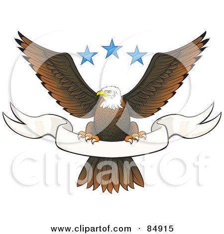
| The logo as such is incomplete: it's cool, but it could be great. Is it possible that there is no-one good with graphic softwares who can make a stylized scarf? Something on this style, but with a horizontal-S shape  eddaje | |
| | | | Conn
Honour member
Number of posts : 734
Age : 45
Country and city : Italy, Rome
Laziale since : I was born
Registration date : 2008-05-26
| | Subject: Re: Our New Logo Tue Jul 13, 2010 10:37 pm | |
| | |
| | | | usampa
Curva Nord

Number of posts : 846
Age : 41
Country and city : Bulgaria , Rousse > Now in France
Laziale since : 1994
Registration date : 2008-05-22
| | Subject: Re: Our New Logo Wed Jul 14, 2010 2:40 am | |
| Hey guys, long time no see I really don't have much time lately, but today I spent 2 hours to sketch my vision about the logo. Of course it is based over the discussion here and the same discussion which were previosly made in laziofever... So, it is only rough sketch, a idea which have to be refined and coloured.... If You think the idea could work and would eventually represent lazioland well I can colored and refine it in the next 3, 4 days. I think about golden eagle, globe in blu hues , and white scarf with blue caption....  And I am posting something I did long ago for fun...  | |
| | | | martinese
Curva Nord

Number of posts : 784
Age : 34
Country and city : Bulgaria, Sofia
Laziale since : 1998
Registration date : 2008-05-23
| | Subject: Re: Our New Logo Wed Jul 14, 2010 10:19 am | |
| Nice to have you back Usampa The second one really looks awesome! | |
| | | | Il Capitano
Curva Maestrelli

Number of posts : 352
Age : 44
Country and city : Germany
Laziale since : 1999
Registration date : 2008-05-22
| | Subject: Re: Our New Logo Wed Jul 14, 2010 12:02 pm | |
| - usampa wrote:
By far the best of them all. This is a really great logo. Creative, innovative, special!!! | |
| | | | Ed
Curva Nord
Number of posts : 688
Age : 42
Country and city : England, Cambridge
Laziale since : 1998
Registration date : 2008-07-23
| | Subject: Re: Our New Logo Wed Jul 14, 2010 12:45 pm | |
| - Ermetico wrote:
In other words u said.. i don like it.
Bravo Ed....u totally change my idea and disagree with 90% of my suggestions....
I need to think...now. Gulp! Sorry Erme, just personal preference! The logo is great, I just thought that for that size a few of the parts became blurry looking or harder to read with black outline. Great designs usampa, not sure about the eagle having teeth though! In regards to the general idea of a scarf/banner being carried by the eagle, by the look of all those images Conn found, isn't it a bit of an overused and unoriginal idea? Just a thought... | |
| | | | Sile
LFever Team Member


Number of posts : 2737
Age : 40
Country and city : Croatia,Zagreb
Laziale since : '96
Registration date : 2008-05-24
| | Subject: Re: Our New Logo Wed Jul 14, 2010 1:03 pm | |
| - Ed wrote:
- isn't it a bit of an overused and unoriginal idea? Just a thought...
Oh no he di'int X2!!!! Ed, you aren't really in the business of making friends are you mate  | |
| | | | Ermetico
Admin


Number of posts : 2227
Age : 62
Country and city : Italia, Roma
Laziale since : 1973
Registration date : 2008-05-02
| | Subject: Re: Our New Logo Wed Jul 14, 2010 1:29 pm | |
| Ed...U are simply fantastic!! I realy apprecdiate your opinion. About Usampa draw....and the scarf request by conn. Personally i like a minimal logo as Secret Samadhy did already in different version . The reason is that this idea is already..used by many groups. In any case this could be nice if we will develop some kind of stikers or merchandise. About Usampa skill i like him very much and i thank him to be back because he has creativity and the only concern is , for me, a kind of asiatic touch " that i don 't like very much in some of his ideas. In any case i am sure that both will join the goal to finalize the logo and banner. Grazie for the efforts! | |
| | | | usampa
Curva Nord
Number of posts : 846
Age : 41
Country and city : Bulgaria , Rousse > Now in France
Laziale since : 1994
Registration date : 2008-05-22
| | Subject: Re: Our New Logo Wed Jul 14, 2010 2:04 pm | |
| - Ermetico wrote:
Personally i like a minimal logo as Secret Samadhy did already in different version . The reason is that this idea is already..used by many groups. In any case this could be nice if we will develop some kind of stikers or merchandise.
About Usampa skill i like him very much and i thank him to be back because he has creativity and the only concern is , for me, a kind of asiatic touch " that i don 't like very much in some of his ideas.
In any case i am sure that both will join the goal to finalize the logo and banner.
Grazie for the efforts! Kind of asiatic touch , hahahahaaha you really made my day Erme, what is that About the minimalistic style, minimal logo design and minimal design in general, I perfectly understand you and it is great, but there is nothing minimal neither in the banner of the laziofever, lazioland, neither in the logos that were presented here....What doesn't work for me in those cases is the lack of unity between the elements (it is copy and paste of different parts taken from elsewhere) and it's just doesn't look like logo at all. I am saying this with all my respect for the work commited of Secret Samadhi and others... | |
| | | | Il Capitano
Curva Maestrelli
Number of posts : 352
Age : 44
Country and city : Germany
Laziale since : 1999
Registration date : 2008-05-22
| | Subject: Re: Our New Logo Wed Jul 14, 2010 3:01 pm | |
| Did Paolo just opt for a minimal logo which was done by copy and paste? Maybe you saw the hoodie I was wearing during the last derby meeting which was white and had usampa's avatar on the chest. I think it's brilliant (probably because of the guy wearing it ), the logo he posted here is brilliant as well. And the best thing, it's unique! People will recognize it. And, as usampa said, with all respect to other people's word, I doubt that will be the case with the other logos. We start a new era, so we should have something really special! | |
| | | | Ermetico
Admin
Number of posts : 2227
Age : 62
Country and city : Italia, Roma
Laziale since : 1973
Registration date : 2008-05-02
| | Subject: Re: Our New Logo Wed Jul 14, 2010 3:31 pm | |
| - usampa wrote:
- Ermetico wrote:
Personally i like a minimal logo as Secret Samadhy did already in different version . The reason is that this idea is already..used by many groups. In any case this could be nice if we will develop some kind of stikers or merchandise.
About Usampa skill i like him very much and i thank him to be back because he has creativity and the only concern is , for me, a kind of asiatic touch " that i don 't like very much in some of his ideas.
In any case i am sure that both will join the goal to finalize the logo and banner.
Grazie for the efforts!
Kind of asiatic touch , hahahahaaha you really made my day Erme, what is that
About the minimalistic style, minimal logo design and minimal design in general, I perfectly understand you and it is great, but there is nothing minimal neither in the banner of the laziofever, lazioland, neither in the logos that were presented here....What doesn't work for me in those cases is the lack of unity between the elements (it is copy and paste of different parts taken from elsewhere) and it's just doesn't look like logo at all. I am saying this with all my respect for the work commited of Secret Samadhi and others... Usi...i only try with my words to explain my perceptions of your draw. Maybe u donpt know but i am , in some sort, a designer too and , most important, i select and promote lines ( on design) for other company in my business market. The asiatic touch" are those volumes and signs that are caratteristic in your style( see your avatar) adn in many other that u did in the past. I have, on the other side, to remind myself that this forum is a mix of nationality and so different tastes and, for this reason , i must find with you and secret samadhi the right solution. Also, and please understand it, i respect each one effort proposal idea and ihope that no one will be ever offended if we select one work. Thanks in any case. | |
| | | | Caxi
Son of Maestrelli


Number of posts : 3884
Age : 35
Country and city : Ireland
Laziale since : 1995
Registration date : 2008-05-23
| | Subject: Re: Our New Logo Wed Jul 14, 2010 3:56 pm | |
| I have to be brutally honest at this point.
- problem with "test" logo is that the eagle's wing overlaps with the text. Too unprofessional in my opinion.
- the colours of our motto and it's alignment with the globe is the logo's "selling point" but does it have to be central and does the globe have to look that...unexciting?
- with the globe, Rome should be visible in the background, maybe marked with a pinpointer (very small, obviously) or a small, small but noticeable colosseum logo or something to that effect (not sure if this idea will work but an excellent design can pull it off)
- the "copy and paste" formation is, with all due respect, probably not good enough.
My design:
I would have an eagle that is clearly in motion that represents our struggle, our history of moving from place to place so that this logo exudes settlement; a true home.
In addition to this, the eagle can appear as if he is heading towards Rome on the globe and he can see it marked with a pinpointer or a Roman symbol.
On his way though, he has dropped a scarf which has come to the fore of the screen.
In other words, what you have is three things. On the left of logo and in the distance, we have the globe...the eagle is centred and is clearly moving towards it and on the right side, we have a falling scarf with LAZIOLAND emblazoned across it.
Now, this may be pushing it far but...if we have that as a logo, maybe it could also be a short animation...
| |
| | | | Secret_Samadhi
Curva Nord
Number of posts : 502
Age : 44
Country and city : Bosnia-Herzegovina, Sweden
Laziale since : 1994
Registration date : 2008-05-23
| | Subject: Re: Our New Logo Wed Jul 14, 2010 6:11 pm | |
| After some editing.  With MMC ( 2010 roman numbers) text just to see how will it look like.  Thanks for both good and encouraging words and critiscism. I know that every person have it's own taste and ideas and it would be mission impossible if we could put every detail in the logo. I belive it would be too much. I tried to follow Ermes idea about a logo being a simple and minimal and that should follow the flag in some way. That's why I choose this design. | |
| | | | usampa
Curva Nord
Number of posts : 846
Age : 41
Country and city : Bulgaria , Rousse > Now in France
Laziale since : 1994
Registration date : 2008-05-22
| | Subject: Re: Our New Logo Wed Jul 14, 2010 6:20 pm | |
| - Ermetico wrote:
Usi...i only try with my words to explain my perceptions of your draw. Maybe u donpt know but i am , in some sort, a designer too and , most important, i select and promote lines ( on design) for other company in my business market.
The asiatic touch" are those volumes and signs that are caratteristic in your style( see your avatar) adn in many other that u did in the past.
I have, on the other side, to remind myself that this forum is a mix of nationality and so different tastes and, for this reason , i must find with you and secret samadhi the right solution.
Also, and please understand it, i respect each one effort proposal idea and ihope that no one will be ever offended if we select one work. Thanks in any case.
It was unusuall description of my style Erme and I really liked it I will mention it to my teachers at the university(I am studying graphic design now 2 years).... I believe every design need strong discussion and feedback and is process with a lot of refinement. For Lazioland, Laziofever I thought we were looking for something directed more to the young people , something more powerfull and illustrative. Minimal style is more for corporated logo IMO and should be very simple and highly stylized, that is why I can't see how so many elements will work together in one place (earth globe, scarfs, eagles flying etc,Italy, colliseum etc..) and where is the stilzation in the presented logos , if we look for minimal style... We have some forced rendering of eagle and earthe gobe that is not stylized at all and don't unite and work with the whole.... It is sport logo, for people who will gather together and will have fun, that is why almost all my projects related with lazio are in this direction.Fun, Fun , Fun ! I respect each one effort also, that is why I have made that critique before. Because only with discussion and clear requirements (what is the goal, what should be the content and so on) we can find the solution that will be in unison with the purpose and the most people's wishes. And I must admit that I didn't read everything in these thread because of lack of time.... But I know what were the demands before when we made the logo for the flag and what I've cursory read now, was similar... That is why I am little bit surprised with this minimal description thing! PS: Respect for Samadhi and for the others who works and worked over the logos here....I don't know fot what reason someone will be offended for something in here Erme ? | |
| | | | Ermetico
Admin
Number of posts : 2227
Age : 62
Country and city : Italia, Roma
Laziale since : 1973
Registration date : 2008-05-02
| | Subject: Re: Our New Logo Wed Jul 14, 2010 7:30 pm | |
| Usampa.
What i mean for offending someone is when i am rude. Rude means that i am sorry to bother ppl with my request and then , after work, i dislike what they create.
In your case, secret and Usampa, we will choose one of the logo and i feel sorry to do that. My gola is to see both of you satisfied.
About the logo\ banner \ discussion let me explain again my goal because under the logo or banner there is:
The image of the community, the idea , the name, the concept and how it could be useful for different tasks.
I, as Paolo , would like to have :
1) One logo that reflect a world of Laziali under one motto . this logo will be used for: official documents( letters) and email avatar( mine) and wherever Lazioland need to be recognized.
The banner: for banner i intend a rectangle where we have: the logo and the description of what is used for:
For example the Fever forum( see my banner above in this trhead) or our present banner in Laziofever.
Then the same banner will change with :Lazioworld gallery or Laziomania history.
Maybe u all understand that i like to have ONE logo as secret samadhy did and i alredy done ( see the small logo in the benner test) but also i would like to have a bigger banner( ufff) where we describe the site, the forum the gallery....
Is that correct? too many things? LET ME KNOW! | |
| | | | Ermetico
Admin
Number of posts : 2227
Age : 62
Country and city : Italia, Roma
Laziale since : 1973
Registration date : 2008-05-02
| | Subject: Re: Our New Logo Wed Jul 14, 2010 7:34 pm | |
| My comments on this two: Usampa: The eagle fingers are too big! the idea in general Yes. The Eagle face ..teeth, eyes, expression.....no. | |
| | | | Caxi
Son of Maestrelli
Number of posts : 3884
Age : 35
Country and city : Ireland
Laziale since : 1995
Registration date : 2008-05-23
| | Subject: Re: Our New Logo Wed Jul 14, 2010 7:37 pm | |
| Paolo, do you like Secret's design enough to use it as a logo? If so, why not let usampa save it and give him a chance to see if he can improve it?
I really think the logo is about 80% right. My problem is it looks plain and static. I don't mind plain and it was what was asked but for whatever reason, usampa's art is vibrant enough that it jumps out of the screen at you. I would like if that logo jumped out at me more.
At the minute, it's not quite as good as the flag in my honest opinion. | |
| | | | Ermetico
Admin
Number of posts : 2227
Age : 62
Country and city : Italia, Roma
Laziale since : 1973
Registration date : 2008-05-02
| | Subject: Re: Our New Logo Wed Jul 14, 2010 7:41 pm | |
| Secret:
My comment: The MMX idea is correct.
The position : no
What about if you reduce this logo 70x70 px? same effect?
Please remind that anylogo need to be saved as a vector file for future pourpose..
Grazie | |
| | | | Ermetico
Admin
Number of posts : 2227
Age : 62
Country and city : Italia, Roma
Laziale since : 1973
Registration date : 2008-05-02
| | Subject: Re: Our New Logo Wed Jul 14, 2010 7:44 pm | |
| - Caxi wrote:
- Paolo, do you like Secret's design enough to use it as a logo? If so, why not let usampa save it and give him a chance to see if he can improve it?
I really think the logo is about 80% right. My problem is it looks plain and static. I don't mind plain and it was what was asked but for whatever reason, usampa's art is vibrant enough that it jumps out of the screen at you. I would like if that logo jumped out at me more.
At the minute, it's not quite as good as the flag in my honest opinion. Caxi u underline a point: we have our flag done and this should be the logo. I made it 6 months ago and , in that case, we work on the flag as crazy. This fact could be a good reason to keep that logo for the future or, as u said, it could be enhanced, improved for the new forum. A complete change ....is too much. | |
| | | | Caxi
Son of Maestrelli
Number of posts : 3884
Age : 35
Country and city : Ireland
Laziale since : 1995
Registration date : 2008-05-23
| | Subject: Re: Our New Logo Wed Jul 14, 2010 7:49 pm | |
| - Ermetico wrote:
- Caxi wrote:
- Paolo, do you like Secret's design enough to use it as a logo? If so, why not let usampa save it and give him a chance to see if he can improve it?
I really think the logo is about 80% right. My problem is it looks plain and static. I don't mind plain and it was what was asked but for whatever reason, usampa's art is vibrant enough that it jumps out of the screen at you. I would like if that logo jumped out at me more.
At the minute, it's not quite as good as the flag in my honest opinion. Caxi u underline a point: we have our flag done and this should be the logo.
I made it 6 months ago and , in that case, we work on the flag as crazy.
This fact could be a good reason to keep that logo for the future or, as u said, it could be enhanced, improved for the new forum.
A complete change ....is too much. Let me try and explain my point. Say, we decide on these aspects of the logo. This is how effective I think each component is: Motto - 100% Title - 80% Eagle - 70% Globe - 40% There is no symmetry in the various aspects; some elements function better than others and thus, we don't have the coherency we have with the flga. Even if certain styles are unwanted, there is coherency when one designs his own work. I think Secret and usampa should take the current logo and put a "slant" on it. Then decide. | |
| | | | Stingray
Aquilotto
Number of posts : 9
Age : 38
Country and city : Seattle, WA
Laziale since : 1998
Registration date : 2010-04-25
| | Subject: Re: Our New Logo Wed Jul 14, 2010 7:50 pm | |
| Sorry to bother but is this new logo entry still open? Who knows I might be able to present something to Lazio Community. | |
| | | | Conn
Honour member
Number of posts : 734
Age : 45
Country and city : Italy, Rome
Laziale since : I was born
Registration date : 2008-05-26
| | Subject: Re: Our New Logo Wed Jul 14, 2010 8:00 pm | |
| Maybe I'm obsessed, but I don't understand why, starting from Secret Samadhi logo, it's not possible to try the following
1) delete the Lazioland on the bottom
2) make the eagle hold a banner with the writing Lazioland
3) adjust, if necessary the size/position of the globe in the background
Usampa, would it be possible to do it? just the banner thing, everything else stays more or less the same | |
| | | | Sponsored content
| | Subject: Re: Our New Logo | |
| |
| | | | | | Our New Logo | |
|
| | Permissions in this forum: | You cannot reply to topics in this forum
| |
| |
| |